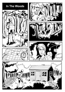
Retrospective. I did this page.....October? It was the weekend of the Supanova convention in Sydney. I didn't go.
I'm really into Mignola's Hellboy work, the way he gently maneuvers the reader from panel to panel, the way he leads the eye around the page, how he speeds sequences up, then brings it to a screeching halt. At first sight, Mignola looks like he breaks the principles of good sequential art, but his juxtiposition of vertical and horizontal panels read flawlessly. Anyway, I wanted to study the way he does this, so this page was the first experiment. A failed experiment.
First up, I love the way Mignola will do a full shot in a vertical panel and then, underneath, a close up in a short horizontal panel. The eye travels from top to bottom, even though a horizontal panel should lead the eye across. In Mignola's case, it leads down because both panels read as a cohesive column. I tried it here, and it failed to read vertically. I analysed the page and I figured out that it only works on the right side of the page!
I redrew the 2nd column multiple times, with different angles, and none of them worked. On the top panel my intention was to have he girl walking up an incline in the foreground plane and the background would be looked down upon by the viewer. As you can tell, I suck at drawing backgrounds and I should have used different lighting to seperate the foreground and background planes (the lighting is all over the place on this page). The next panel was supposed to be a "deliverance" style stalker shot of the girl walking up a little incline. It didn't work because 1) the girl's shadow is too big and attracts the eye too much to notice the silhouetted bushes in the foreground.
Well that's it for this page. It's a failed experiment, but I learned a thing or two from it.

No comments:
Post a Comment